Dumbbell plot for comparison is the correct usage, and it is described much better than I ever could by Connor Rothschild on his blog. In his post, he comprehensively demonstrates using the R package ggalt and how to make and interpret multiple different types of dumbbell plots.
What I want to add here is a use-case that I am promoting in a chapter I’m writing with Natasha Dukach, my forever intern, on dashboards. It’s how to use a dumbbell plot for comparison of rated items. I’ll give an example using the RateMyProfessors.com web site – but I’m going to use it for college ratings, not professor ratings (which can get pretty mean).
Dumbbell Plot for Comparison of Rated Items
A lot of times, web sites that rate items (hotels, colleges, tech) will provide an overall rating, and then ratings on certain characteristics. As an example, a hotel web site might have users rank hotels on several dimensions, such as location, cleanliness, and price.
RateMyProfessor.com uses this approach for ranking their colleges. I decided to make a dumbbell plot for comparison of my alma mater – the University of Minnesota, Twin Cities – and the most popular college in my new home in Massachusetts, which is Harvard University. I took a screen shot of the ratings on September 20, 2021, and put them on a slide for you.
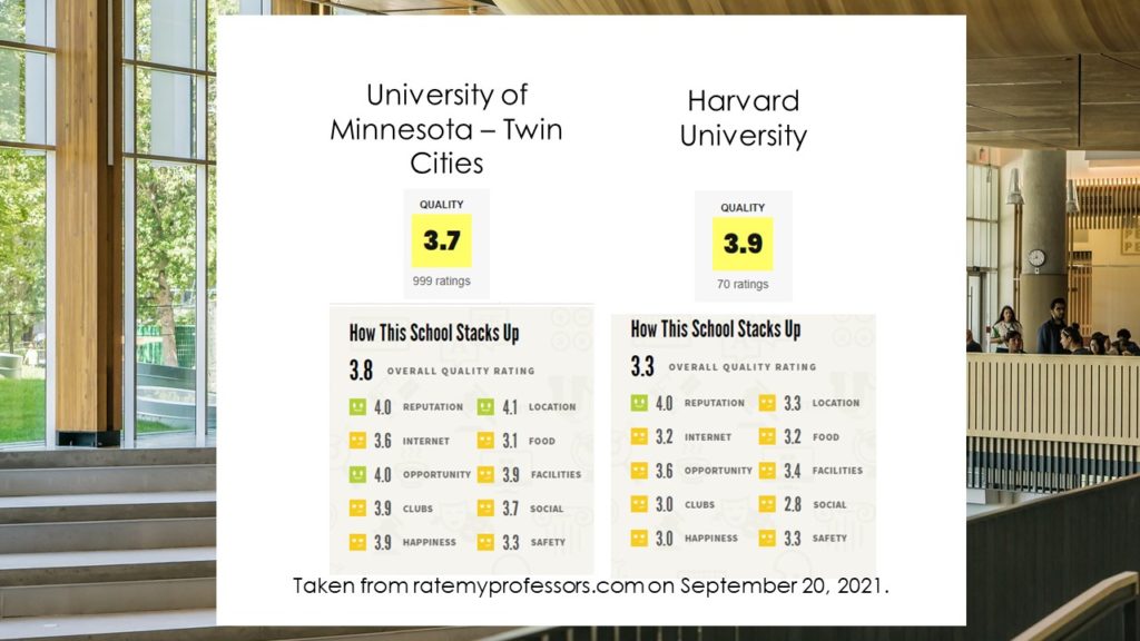
You will see that it provided two quality ratings that were different – one on the landing page, and one above the other ratings labeled “overall quality”. I did not dig into any documentation to find out why, but I noticed they were close to one another. Also, I was surprised to see that the ratings on many of the characteristics, such as location, food, and safety, were very similar.
It was hard to grasp so many different comparisons at once numerically, so I made the dumbbell plot for comparison below using the ggalt package in R.
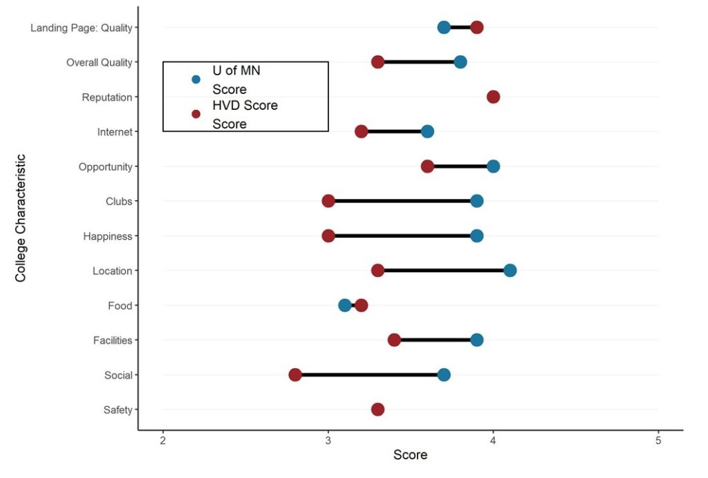
Since both the U of MN and Harvard use a dark red color (technically not the same color – “maroon” vs. “crimson”, respectively), I thought I’d use red for Harvard only, and a blue color to represent cold Minnesota for the U of MN. The plot makes it easy to see that Harvard is only better than the U of MN on two things – the quality score on the landing page, and food. To everyone who sees this, please understand – the food off-campus in Minneapolis is much better than in anywhere in Boston. I mean Indian food and vegetarian/organic food – and also, make sure you order the mock duck – from anywhere that serves it!
The dumbbell plot also makes it totally obvious that in terms of reputation and safety, at least on RateMyProfessors.com, Harvard and the U of MN are the same. I think I’d agree with the safety score – but reputation? If this is true, you are wasting your money going to Harvard!
The plot also easily shows that the U of MN is far better on many of the points. However, this is a bit biased – I did not anchor x at zero, which is the beginning of the rating scale. I wanted the magnify the differences – but this can lead to a biased interpretation, that the differences are bigger than they are.
In the end – what is important to you when choosing a college? If you don’t care about the food and you do care about the happiness, then maybe the U of MN is for you. And who knows how good these ratings are from RateMyProfessors.com? Wouldn’t a web site with that topic attract disgruntled students? That could be another source of bias
How to Make a Dumbbell Plot for Comparison of Rated Items
You can get this code on GitHub, but I’ll show it here and explain it. As is always true, we need to start by making a data frame designed to be plotted in the ggalt package.
Preparing the dataset
Order <- c(12, 11, 10, 9, 8, 7, 6, 5, 4, 3, 2, 1)

Char <- c("Landing Page: Quality",
    "Overall Quality","Reputation",
    "Internet", "Opportunity",
    "Clubs", "Happiness",
    "Location",
"Food","Facilities","Social", "Safety")

UofMScores <- c(3.7, 3.8, 4.0, 3.6, 4.0, 3.9,
    3.9, 4.1, 3.1, 3.9, 3.7, 3.3)

HVDScores <- c(3.9, 3.3, 4.0, 3.2, 3.6, 3.0,
    3.0, 3.3, 3.2, 3.4, 2.8, 3.3)

WebPageScores <- as.data.frame(cbind
    (Order, Char, UofMScores, HVDScores))

class(WebPageScores$UofMScores)
Let’s examine this code:
- The strategy for making this dataframe is to first make the columns I want as vectors, and then “column bind” (cbind) them together as a dataframe.
- The Order vector (which will turn into the Order column in the dataframe) is made so I can use the reorder command in ggplot2 and put the rated items in the same order as they appear on the web page. I realized that if I reversed the order when I coded this column, then using reorder But another way I could have done it is just ordered them forward, then called for reverse ordering in the ggplot2 command. I just thought it was easier to code this way.
- The next vector, Char, stands for characteristic. It’s also obviously a character-formatted variable.
- The UofMScores and HVDScores vectors contain the scores on the various items from the two colleges.
- Order, Char, UofMScores, and HVDScores are then column-bound with cbind into a dataframe. We make sure the resulting object is a dataframe by using data.frame.
- This produces the dataframe WebPageScores. This is what we will use to make the dumbbell plot for comparison.
Finishing Touches to the Data
We have a few more things to do before we plot. First, we need to convert Order and the score variables to a numeric format. We also have to pick colors for the dots representing the U of MN and Harvard, and load our packages.
#convert scores to numeric

WebPageScores$Order_n <- as.numeric(WebPageScores$Order)
WebPageScores$UofMScores_n <- as.numeric(WebPageScores$UofMScores)
WebPageScores$HVDScores_n <- as.numeric(WebPageScores$HVDScores)

#designate colors of the points
UofMN_col <- c("#1a759f")
HVD_col <- c("#9b2226")

#load packages
library(ggplot2)
library(ggalt)
library(tidyverse)
Let’s unpack this code:
- Running the class command on the UofMScores shows that it is in character format. So is Order and the other score variable. These need to be converted to numeric to be used in the plot.
- The next three lines show the use of the numeric command to convert the original variables (e.g., Order) to ones that are in numeric format and have the _n suffix (e.g., Order_n)
- Two vectors are coded with the hex code for the color wanted: UofMN_col is blue, and HVD_col is red.
- Finally, we load packages
Building the Plot
Here is the code to build the plot:
#build the plot
ggplot() +
geom_segment(data=WebPageScores, aes(y= reorder(Char, Order_n),
    yend=reorder(Char, Order_n), x=2, xend=5),
    color="gray87",
    size=0.05)+
geom_dumbbell(data=WebPageScores, aes(y=reorder(Char, Order_n),
    x=UofMScores_n, xend=HVDScores_n),
    size = 1.5,
    color="black",
    size_x = 5,
    size_xend = 5,
    colour_x = UofMN_col,
    colour_xend = HVD_col) +
ylab(c("College Characteristic")) +
xlab(c("Score")) +

#hand-crafted legend
geom_rect(aes(xmin = 2, xmax = 3, ymin = 9, ymax = 11),
    fill = NA, alpha = 0.4, color = "black") +
    annotate("point", x = 2.2, y =10.5, size = 3,
    colour = UofMN_col) +
annotate("text", x = 2.3, y=10.5,
    label = "U of MN nScore", hjust=0) +
annotate("point", x = 2.2, y = 9.5, size = 3, colour = HVD_col) +
annotate("text", x = 2.3, y= 9.5,
    label = "HVD Score nScore", hjust=0) +
theme_classic()
Let’s look at this code more closely:
- The code is split into two parts: making the plot, and making my kludgy hand-crafted legend. I’ve found that sometimes, it’s just easier to kludge a legend in ggplot2 than to try to program it in.
- The first set of code for geom_segment builds the background for the dumbbells. If you run this code alone, you’ll see this (also shown on the original blog post referenced above). Notice the use of the reorder command, and the Order_n
- The next set of code builds the dumbbells. color=”black” designates that the horizontal lines in the dumbbell will be black. x and xend define where to plot the scores, and colour_x and colourx_end define the colors.
- ylab and xlab relabel the axes.
Then comes the kludgy legend:
- I start by drawing a black, transparent rectangle with geom_rect by specifying the coordinates and setting the fill to NA and the color to “black”.
- Then using the annotate command, I place points and text on the plot to create the legend.
Originally published on September 20, 2021. Code reformatted and video added on April 2, 2022. Refreshed banners on March 12, 2023.
Read all of our data science blog posts!

Descriptive Analysis of Black Friday Death Count Database: Creative Classification
Descriptive analysis of Black Friday Death Count Database provides an example of how creative classification [...]
Nov

Classification Crosswalks: Strategies in Data Transformation
Classification crosswalks are easy to make, and can help you reduce cardinality in categorical variables, [...]
Nov

FAERS Data: Getting Creative with an Adverse Event Surveillance Dashboard
FAERS data are like any post-market surveillance pharmacy data – notoriously messy. But if you [...]
Nov

Dataset Source Documentation: Necessary for Data Science Projects with Multiple Data Sources
Dataset source documentation is good to keep when you are doing an analysis with data [...]
Nov

Joins in Base R: Alternative to SQL-like dplyr
Joins in base R must be executed properly or you will lose data. Read my [...]
Nov

NHANES Data: Pitfalls, Pranks, Possibilities, and Practical Advice
NHANES data piqued your interest? It’s not all sunshine and roses. Read my blog post [...]
Nov

Color in Visualizations: Using it to its Full Communicative Advantage
Color in visualizations of data curation and other data science documentation can be used to [...]
Oct

Defaults in PowerPoint: Setting Them Up for Data Visualizations
Defaults in PowerPoint are set up for slides – not data visualizations. Read my blog [...]
Oct

Text and Arrows in Dataviz Can Greatly Improve Understanding
Text and arrows in dataviz, if used wisely, can help your audience understand something very [...]
Oct

Shapes and Images in Dataviz: Making Choices for Optimal Communication
Shapes and images in dataviz, if chosen wisely, can greatly enhance the communicative value of [...]
Oct

Table Editing in R is Easy! Here Are a Few Tricks…
Table editing in R is easier than in SAS, because you can refer to columns, [...]
Aug

R for Logistic Regression: Example from Epidemiology and Biostatistics
R for logistic regression in health data analytics is a reasonable choice, if you know [...]
1 Comments
Aug

Connecting SAS to Other Applications: Different Strategies
Connecting SAS to other applications is often necessary, and there are many ways to do [...]
Jul

Portfolio Project Examples for Independent Data Science Projects
Portfolio project examples are sometimes needed for newbies in data science who are looking to [...]
Jul

Project Management Terminology for Public Health Data Scientists
Project management terminology is often used around epidemiologists, biostatisticians, and health data scientists, and it’s [...]
Jun

Rapid Application Development Public Health Style
“Rapid application development” (RAD) refers to an approach to designing and developing computer applications. In [...]
Jun

Understanding Legacy Data in a Relational World
Understanding legacy data is necessary if you want to analyze datasets that are extracted from [...]
Jun

Front-end Decisions Impact Back-end Data (and Your Data Science Experience!)
Front-end decisions are made when applications are designed. They are even made when you design [...]
Jun

Reducing Query Cost (and Making Better Use of Your Time)
Reducing query cost is especially important in SAS – but do you know how to [...]
Jun

Curated Datasets: Great for Data Science Portfolio Projects!
Curated datasets are useful to know about if you want to do a data science [...]
May

Statistics Trivia for Data Scientists
Statistics trivia for data scientists will refresh your memory from the courses you’ve taken – [...]
Apr

Management Tips for Data Scientists
Management tips for data scientists can be used by anyone – at work and in [...]
Mar

REDCap Mess: How it Got There, and How to Clean it Up
REDCap mess happens often in research shops, and it’s an analysis showstopper! Read my blog [...]
Mar

GitHub Beginners in Data Science: Here’s an Easy Way to Start!
GitHub beginners – even in data science – often feel intimidated when starting their GitHub [...]
Feb

ETL Pipeline Documentation: Here are my Tips and Tricks!
ETL pipeline documentation is great for team communication as well as data stewardship! Read my [...]
Feb

Benchmarking Runtime is Different in SAS Compared to Other Programs
Benchmarking runtime is different in SAS compared to other programs, where you have to request [...]
Dec

End-to-End AI Pipelines: Can Academics Be Taught How to Do Them?
End-to-end AI pipelines are being created routinely in industry, and one complaint is that academics [...]
Nov

Referring to Columns in R by Name Rather than Number has Pros and Cons
Referring to columns in R can be done using both number and field name syntax. [...]
Oct

The Paste Command in R is Great for Labels on Plots and Reports
The paste command in R is used to concatenate strings. You can leverage the paste [...]
Oct

Coloring Plots in R using Hexadecimal Codes Makes Them Fabulous!
Recoloring plots in R? Want to learn how to use an image to inspire R [...]
Oct

Adding Error Bars to ggplot2 Plots Can be Made Easy Through Dataframe Structure
Adding error bars to ggplot2 in R plots is easiest if you include the width [...]
Oct

AI on the Edge: What it is, and Data Storage Challenges it Poses
“AI on the edge” was a new term for me that I learned from Marc [...]
Jun

Pie Chart ggplot Style is Surprisingly Hard! Here’s How I Did it
Pie chart ggplot style is surprisingly hard to make, mainly because ggplot2 did not give [...]
Apr

Time Series Plots in R Using ggplot2 Are Ultimately Customizable
Time series plots in R are totally customizable using the ggplot2 package, and can come [...]
Apr

Data Curation Solution to Confusing Options in R Package UpSetR
Data curation solution that I posted recently with my blog post showing how to do [...]
Apr

Making Upset Plots with R Package UpSetR Helps Visualize Patterns of Attributes
Making upset plots with R package UpSetR is an easy way to visualize patterns of [...]
4 Comments
Apr

Making Box Plots Different Ways is Easy in R!
Making box plots in R affords you many different approaches and features. My blog post [...]
Mar

Convert CSV to RDS When Using R for Easier Data Handling
Convert CSV to RDS is what you want to do if you are working with [...]
Mar

GPower Case Example Shows How to Calculate and Document Sample Size
GPower case example shows a use-case where we needed to select an outcome measure for [...]
Feb

Querying the GHDx Database: Demonstration and Review of Application
Querying the GHDx database is challenging because of its difficult user interface, but mastering it [...]
Feb

Variable Names in SAS and R Have Different Restrictions and Rules
Variable names in SAS and R are subject to different “rules and regulations”, and these [...]
Feb

Referring to Variables in Processing Data is Different in SAS Compared to R
Referring to variables in processing is different conceptually when thinking about SAS compared to R. [...]
Jan

Counting Rows in SAS and R Use Totally Different Strategies
Counting rows in SAS and R is approached differently, because the two programs process data [...]
Jan

Native Formats in SAS and R for Data Are Different: Here’s How!
Native formats in SAS and R of data objects have different qualities – and there [...]
Jan

SAS-R Integration Example: Transform in R, Analyze in SAS!
Looking for a SAS-R integration example that uses the best of both worlds? I show [...]
Dec

Dumbbell Plot for Comparison of Rated Items: Which is Rated More Highly – Harvard or the U of MN?
Want to compare multiple rankings on two competing items – like hotels, restaurants, or colleges? [...]
2 Comments
Sep

Data for Meta-analysis Need to be Prepared a Certain Way – Here’s How
Getting data for meta-analysis together can be challenging, so I walk you through the simple [...]
Jul

Sort Order, Formats, and Operators: A Tour of The SAS Documentation Page
Get to know three of my favorite SAS documentation pages: the one with sort order, [...]
Nov

Confused when Downloading BRFSS Data? Here is a Guide
I use the datasets from the Behavioral Risk Factor Surveillance Survey (BRFSS) to demonstrate in [...]
2 Comments
Oct

Doing Surveys? Try my R Likert Plot Data Hack!
I love the Likert package in R, and use it often to visualize data. The [...]
2 Comments
Oct

I Used the R Package EpiCurve to Make an Epidemiologic Curve. Here’s How It Turned Out.
With all this talk about “flattening the curve” of the coronavirus, I thought I would [...]
Mar

Which Independent Variables Belong in a Regression Equation? We Don’t All Agree, But Here’s What I Do.
During my failed attempt to get a PhD from the University of South Florida, my [...]
Aug
Want to compare multiple rankings on two competing items – like hotels, restaurants, or colleges? I show you an example of using a dumbbell plot for comparison in R with the ggalt package for this exact use-case!
Hi, Do you know if its possible to put error bars on one of the ends of a dumbbell plot?
Hi, thanks for the comment. I could not find an example of anyone doing that with a dumbbell plot – but then I realized, you should be able to just use an additional ggplot command to add the error bars, which is what you do in other plots (e.g., bar charts with error bars, and line graphs with error bars). You would basically place a geom_errorbar object and position it around the dots. See an example of what I mean with geom_errorbar here only with a bar chart: https://dethwench.com/adding-error-bars-to-plots-in-r/